When it comes to YouTube we all know how important that video thumbnail is. So definitely don’t use that auto-generated thumbnail and don’t muck around with Photoshop. In this article, I’m going to share with you how to create an awesome video custom thumbnail using just Canva for FREE.
If you’re doing anything on YouTube, you know the importance of getting your YouTube custom thumbnail right. It’s the difference between someone clicking play on your video and scrolling right past getting that critical clickthrough rate, which is so important in YouTube’s algorithm and actually getting your videos watched. For non graphic designers out there, it can often be a real struggle to quickly and easily create eye-catching custom thumbnail designs without getting bogged down in complicated software like Photoshop.
So I’m going to walk you through how to use the free version of online graphic design software Canva to create your custom thumbnails and make them look awesome. Here we go.
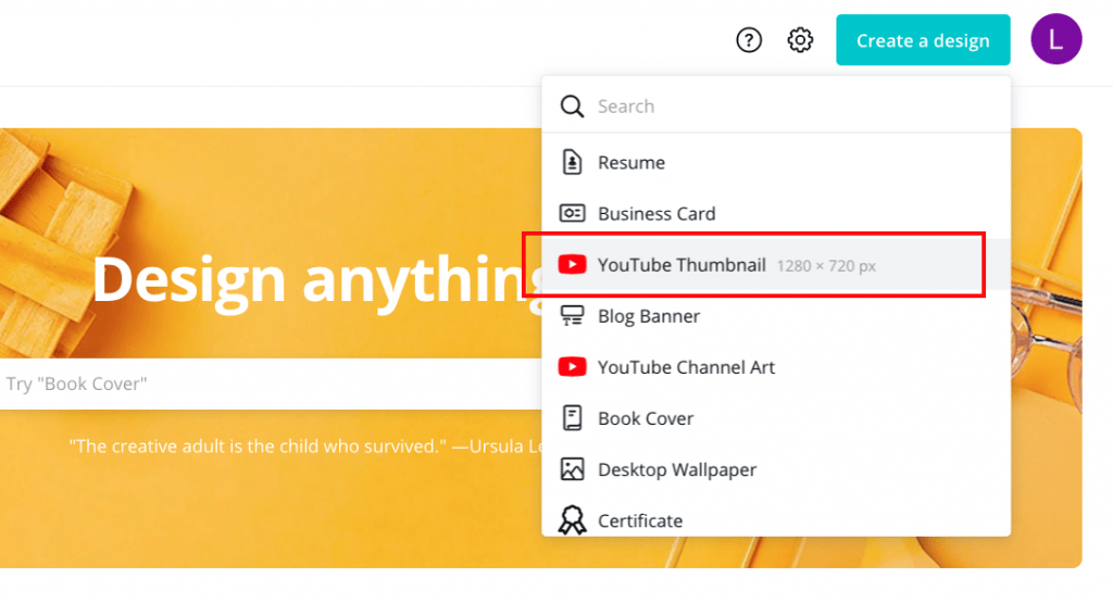
So let’s head on over to Canva.com to get started. First of all, you’re going to want to create a new design and choose the YouTube thumbnail template. This will give you a custom canvas size of 1280 x 720 pixels, which is ideal for YouTube.
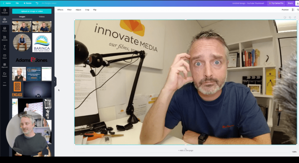
Now of course, Canva as always, will give you lots of different templates that you can use as a starting point, where in this case, we’re going to start from scratch. We want to bring in a still image, which we captured whilst we were recording the video specifically for the purpose of the thumbnail. So we go to uploads and we go to upload an image or video.
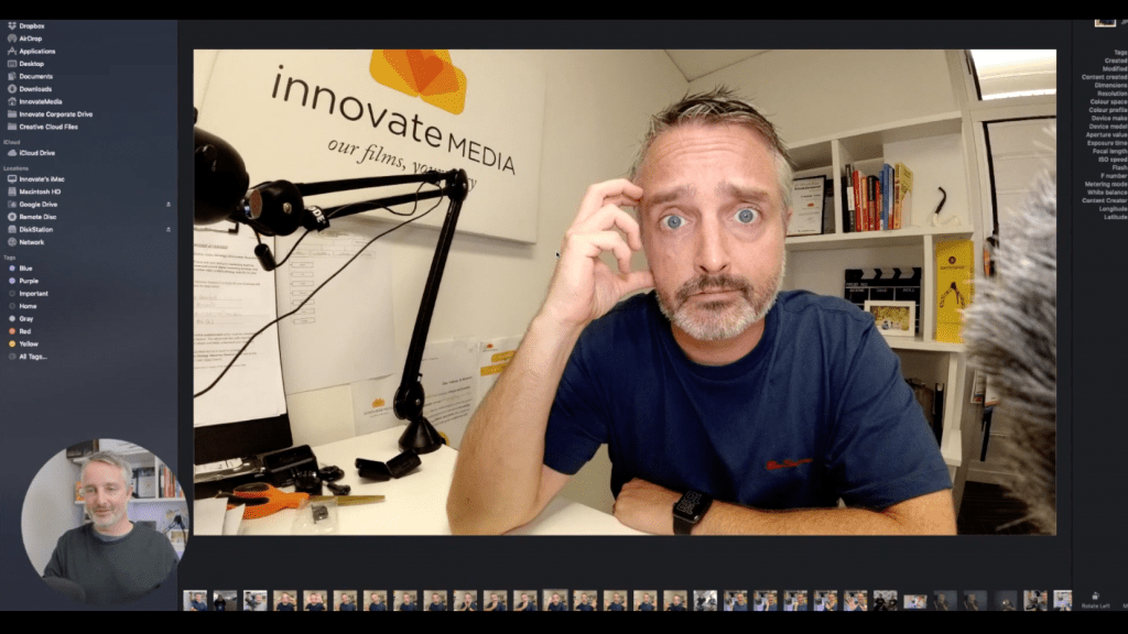
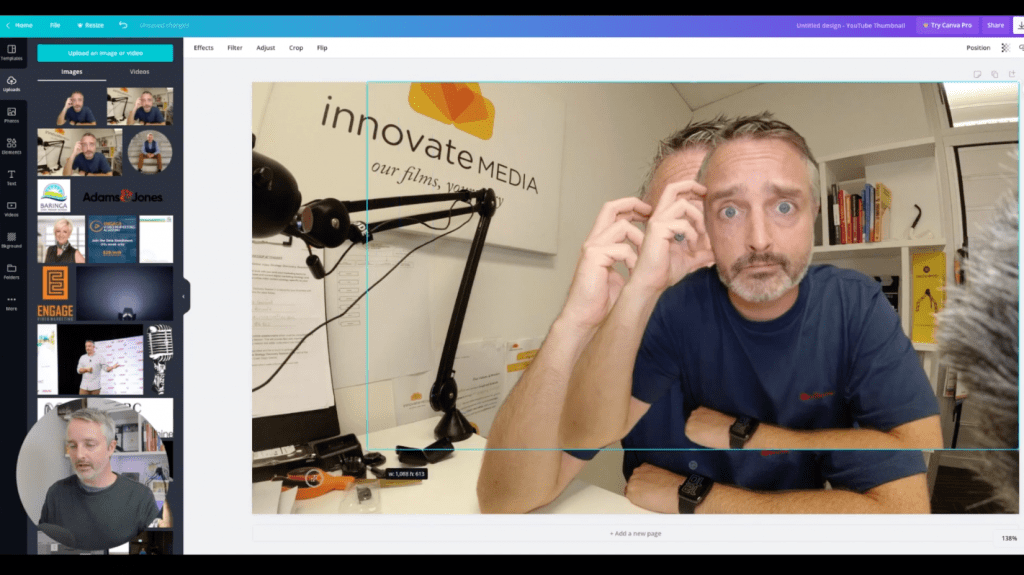
Now, before we get into this I just want to share with you the importance of actually capturing some still images or awesome frames of your video while you’re recording your video for the specific purpose of using these for an eye catching video thumbnail. As an example, after wrapping up a recording, I did a few poses to the camera. Some of them pulling some funny faces, pointing at things, just giving me some options to use in the edit. In this case, I’m going to use the one right here with the scratching of the head.
So now that I know what still images I’m going to use, I’m going to go back to Canva. Once it’s imported, I can click and bring that into my canvas and scale it up to fit the entire background of the canvas. And from here, I want to start playing with the layers to create an eye catching image.
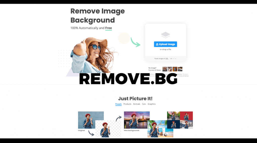
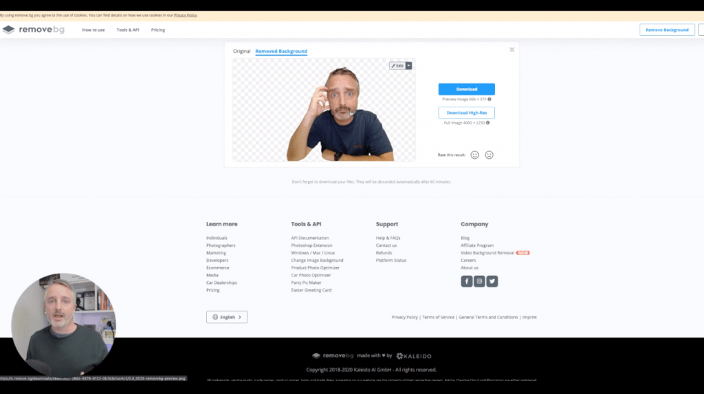
So one of the first things I want to do is actually isolate the person from the image so that we can bring that out from the background. Now, an easy way to do this only if you have the pro version of Canva, which is a paid version of Canva, is to click on this background remover tool and use that. However, I did promise to be able to do this for free using the free version of Canva. So I’ve got your back. What you want to do is to actually take this same image and head over to Remove.bg in another window of your browser and upload that same image file to Remove.bg.
This will actually use it an artificial intelligence powered process to identify what the key subject is within the photo and remove the rest of the background. And it does a pretty good job.
Removed.bg will allow you to use this tool for free, but only to download a lower resolution image. So you can see here, we’re getting a preview image of 666 x 375pixels. Now it’s not the highest resolution that’s possible. You can go through and pay for Removed.bg and download the high res version, but for the purpose of a YouTube thumbnail, I find it that this lower resolution version can actually work quite well. It’s perfectly acceptable. So I’m going to download that version. And once I’ve got that, we’re going to go back into Canva and I’m going to add this to my upload section. This is where the fun begins, I can drop in this lower resolution version of myself with the image with the background removed and scale it up to basically overlay over the top.
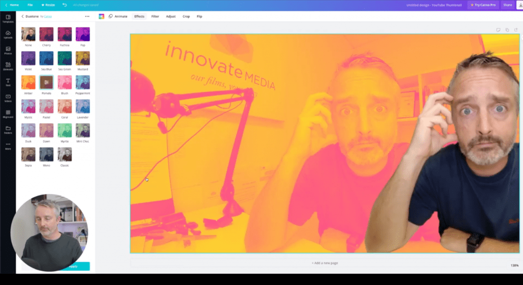
So now I got two layers here. I’ve got the slightly lower resolution. You can see the slight resolution drop there, but it’s still perfectly acceptable. And then I’ve got the bottom layer there as well. So what I’m going to do now is I’m going to go back and just move this one slightly out of the way. I’m going to select the bottom layer, and then I’m going to apply an effect to this. So in this case, I’m going to go to the effects and I’m going to apply a duo tone effect here. Now the duo tone effect is something that you may need to add into camera whenever it is free, but you may need to actually find it within some of these added effects. But once you’ve got the duotone effect or click on “see all” I’m going to choose this pomelo effect, quite like the look of that kind of gives it, that two-tone effect, which is super cool.
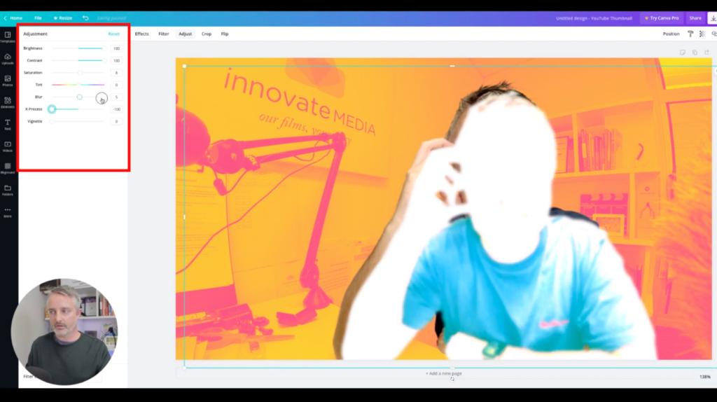
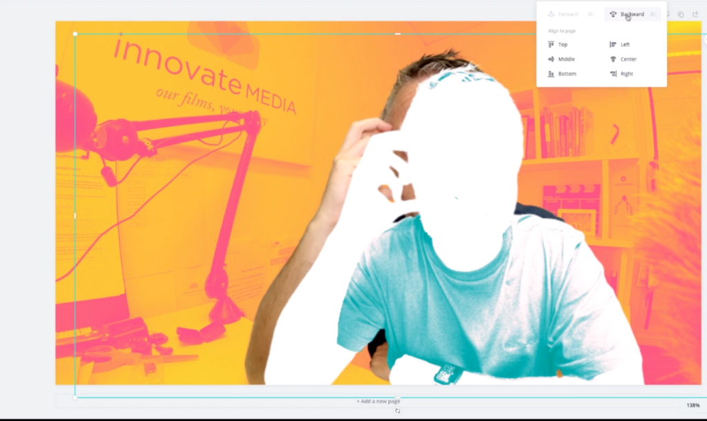
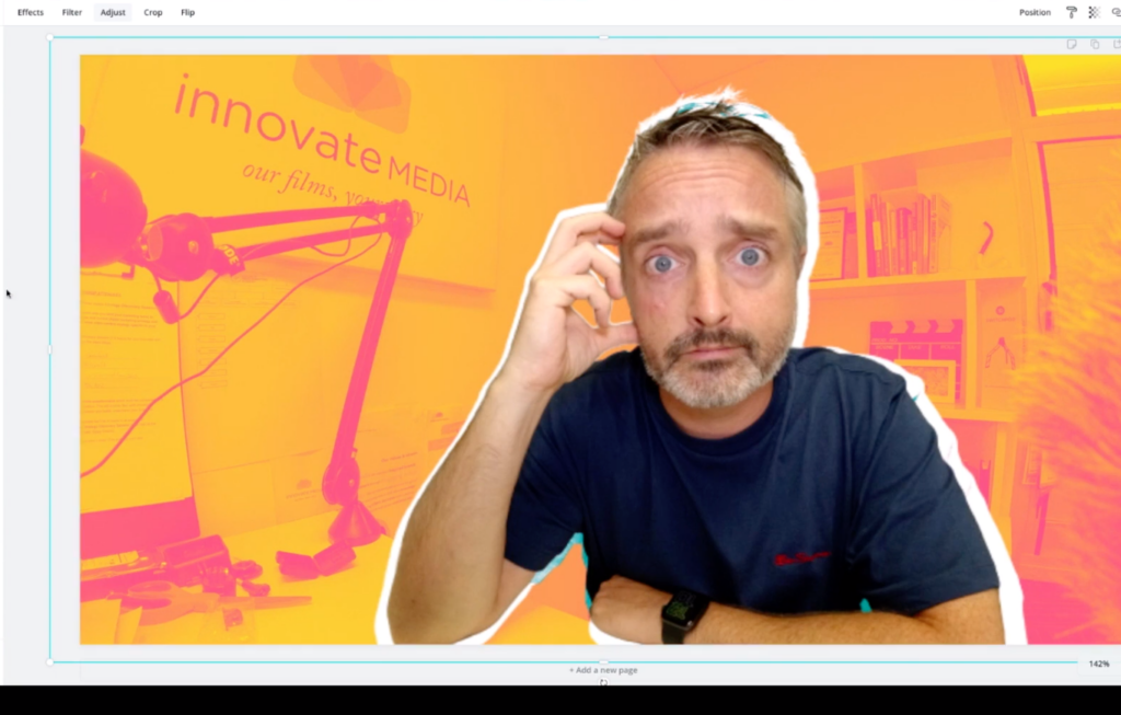
And then I’m going to bring my image back over the front. And from there, you’re starting to see, this is already looking like an eye catching thumbnail. We can apply some adjustments to this as well. We can adjust the contrast a little, maybe boost the brightness or wind it back, maybe increase the saturation and just slightly improve the look of that image. Now, what I really like here in a thumbnail is to be able to create a border effect behind the overlaid image. So what I’m going to do now is actually whilst I’ve selected that top layer with the cutout version of my face there, I’m going to duplicate that and I’m going to apply some pretty cool harsh adjustments to that layer. So I’m going to go to the adjust pane, and I’m going to wind up the brightness and the contrast and Push this X-Process all the way down. Finally drop the saturation right down as well. So it’s pretty harsh effects here, but let me show you what we’re going to do next.
So now what I want to do is to move this highlighted layer below the second layer down below the image of my face. So to do that, I’m going to click on position and I’m going to click backwards. And now that’s put that behind the other layer and I can reposition. Now, if you do find it hard to select the layer that you want to move, you can actually press the command key or the control key on windows and then select the layer underneath. And that will let you actually make sure that you’ve selected the right layer.
So what I’m going to do now is scale that layer up by dragging the handles there and reposition it behind so that we get that cool border effect behind the subject.
So next thing we want to do is to add some text layers. When it comes to using text on a thumbnail, you need to consider that in many cases, the thumbnail is going to be quite small in YouTube search results. So you want to make sure that you’re using texts that really catches the eye and hooks the viewers attention and engages them enough to want to click. So we’re gonna use a text template here and we’re going to muck around and scale it and play with it a little bit further. So first of all, I want to decide on what my text is going to be. That’s going to hook the attention of the viewer. And in this case, I’m going to say “Create Eye-catching Thumbnails” and I’m going to scale that text down.
Finally drop the saturation right down as well. So it’s pretty harsh effects here, but let me show you what we’re going to do next.
And once I’ve played around with and manipulated a few of the texts and other assets using all of the standard Canva tools, and you can see that we end up with an eye catching thumbnail, which looks fantastic. Even when shrunk right down into the small size, you’ll often find in YouTube search results. And then all you need to do is click on the download option and choose PNG. Click on download and away you go. So I can’t wait to see your custom thumbnail designs created in Canva in this way. And don’t forget to save your template in Canva so that you can replicate it again and again, each time you need to create another custom thumbnail.
